“The color for me…” it isn’t only the name chosen for this blog but it is also the way that I prefer to the opening a debate or a simple exchange of opinions on the topic.
In this declaration of intent is implicit the double nature: color is subjective and it’s at the same time objective.
You could spend hours, days and years discussing theories, to date we don’t have an absolute truth but different points of view. There are many studies and then how to take your first steps in the wonderful world of colors?
Let’s define the Color
“colour n. [lat. color -ōris]. – 1. a. A term indicating, in physics, both the physiological sensation experienced under the effect of lights of different quality and composition (subjective c.) and the light itself, monochromatic or polychromatic (simple objective c. and compound objective c. respectively), i.e. consisting of one or more electromagnetic radiations of certain wavelengths…”
text from Portale dell’Istituto della Enciclopedia italiana Treccani* “www.treccani.it”
http://www.treccani.it/vocabolario/colore/
“Color (American English), or colour (Commonwealth English), is the characteristic of human visual perception described through color categories, with names such as red, orange, yellow, green, blue, or purple. This perception of color derives from the stimulation of cone cells in the human eye by electromagnetic radiation in the visible spectrum. Color categories and physical specifications of color are associated with objects through the wavelength of the light that is reflected from them. This reflection is governed by the object’s physical properties such as light absorption, emission spectra, etc.”
text from Wikipedia, the free encyclopedia
Considering the complexity of the subject, one of my favourite definitions is the one centred on the perceptual phenomenon, which occurs when there is an interaction between object, eye/brain and light source.
Impression, Sensation, Perception and more.
Color is emotion, energy, communication, culture. Society attributes a definition and a meaning to it, as the French professor Michel Pastoureau maintains, by constructing codes and values.
Color & Context
The observation, the study, the meaning of a color is determined in relation to the context of reference.
Let’s take the case in which we evaluate a dress or an accessory to buy:
the choice of a color should be contextualized, so beyond the trend of the season we will evaluate the colors most appropriate to our features (see also the post on Colors yes, Colors no), the occasion of use, the need to purchase the moment and how much we have been influenced by various (social) media.
Another factor not to be overlooked is the influence of the color: usually we will not choose a single shade, unless you decide for a monochrome outfit. Colors affect each other, so choosing a single shade without considering its chromatic interactions with the other elements that we will combine, could lead to unexpected and sometimes unwanted results.
Perceiving and defining colors
Color isn’t only a perceptual phenomenon and its evaluation must take into account other factors. There is no physical measurement scale, which is why everyone will have their own idea of the type of color they see.
Color sensitivity varies from individual to individual.
There are also other factors, in addition to the psychological and physiological effects, that influence the visual perception as the light source, the size of the object being observed and the context in which it is placed.
THE COLOR IN PILLS
Considering the above, it is clear that giving a name, identifying, describing, communicating a chromatic sensation, requires study, visual training and linguistic exercise, creativity but also great sensitivity. Trend analysis requires an appropriate and comprehensible language for the classification of color ranges.
Color Attributes
The basic attributes of color, as they appear to us, are: hue, brightness, and saturation.
HUE
is the feature that allows us to clearly distinguish one color from another such as: YELLOW, RED, BLUE…

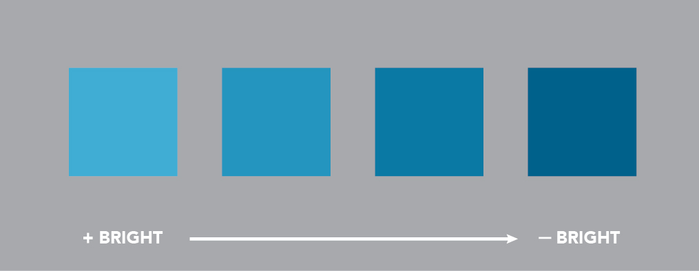
BRIGHTNESS
is the amount of light we can perceive when we look at a color.
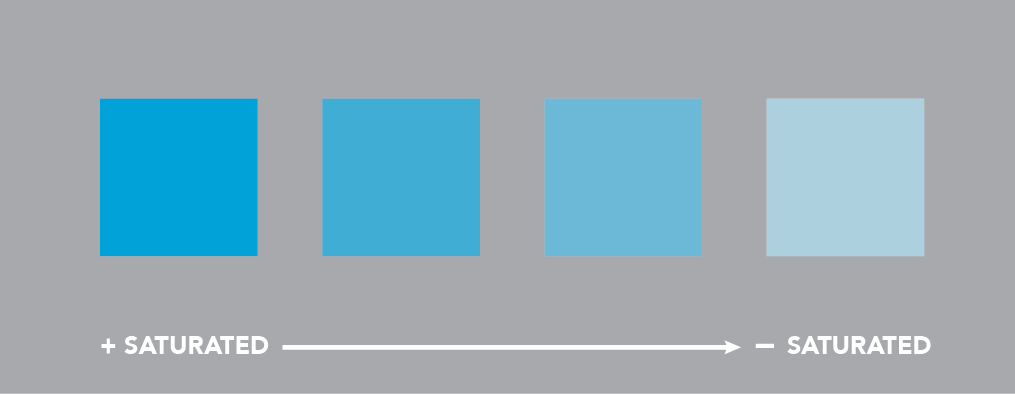
SATURATION
is the amount of color present, more properly we should speak of “fullness of color“, understood as the characteristic of a color to be more or less colored, more or less “greyed“.
Methods of representation
The arrangement of the colors can be based on studies and various theories. There are methods of linear, circular and three-dimensional representation. One of the most famous and widespread is the circular distribution of colors.
THE CIRCLE OF ITTEN
The painter Johannes Itten dedicated his life to the world of colors. His theory in the world of art is based on the chromatic arrangement through a circular scheme.
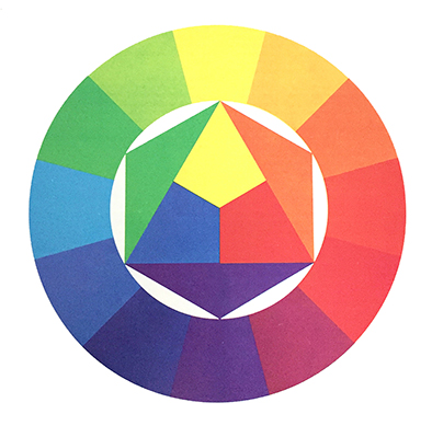
The three primary colors are arranged within an equilateral triangle. In the circle in which the triangle is inscribed, a hexagon is developed in which three other triangles of secondary colors are placed, obtained from the primary colors combined with two by two.
The primary and secondary colors are shown in the outermost circle, divided into 12 equal parts: the color resulting from their combination is placed between a primary and a secondary color. Between a primary and a secondary, the tertiary color is inserted, obtained by mixing them.
PRIMARY COLORS
Colors that aren’t obtained by mixing with other colors.
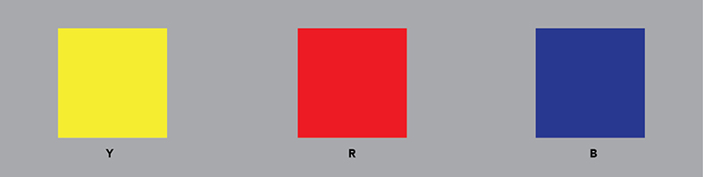
YELLOW, RED AND BLUE.
SECONDARY COLORS
Colors obtained by mixing two primary colors.
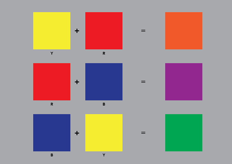
YELLOW + RED = ORANGE
RED + BLUE = PURPLE
BLUE + YELLOW = GREEN
ACHROMATIC COLORS
Colors without “hue”.

WHITE, GREY, BLACK.
COMPLEMENTARY COLORS
Two colors are defined as complementary, the pigments of which, when mixed together, generate a neutral grey.

YELLOW and PURPLE, diametrically opposed in the arrangement of the chromatic circle, are two complementary colors.
COLD & WARM
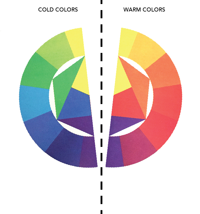
Dividing the chromatic circle of Itten’s “pure” shades, with a vertical line connecting yellow to purple, we obtain a division between cold colors (green, blue, purple) and warm colors (yellow, orange, red).
The subdivision of the circle into two parts is a generic way to distinguish the two chromatic families, in relation to the sensation of temperature that we perceive. In particular, each colour obtained by mixing may have a “cold” or “warm” connotation.


Let’s learn to observe colors!
Experience will allow us to grasp and acquire new nuances.
* “colour n. [lat. color -ōris]. – 1. a. A term indicating…” : Courtesy of the Istituto della Enciclopedia Italiana Treccani. Any reproduction and/or use not of a strictly personal nature is prohibited. It is absolutely forbidden to retransmit or send in any form.